This week marked a significant development in the world of artificial intelligence, as Apple joined tech giants like Google, OpenAI, Anthropic, Meta, and others in the ongoing quest to define what an AI icon should look like. Amidst this flurry of activity, Apple unveiled its contribution.
Apple’s representation of AI comes in the form of a circular shape composed of seven loops — or is it a circle housing a slightly skewed infinity symbol? Perhaps it manifests as “New Siri,” characterized by a glowing effect around the edges of your phone. The challenge, it seems, lies in visually capturing something as abstract and multifaceted as artificial intelligence, which performs complex tasks yet lacks a definitive appearance.
The debate over AI’s visual identity reflects broader disagreements within the industry. While early icons depicted AI as robots, wizard hats, or magic wands — symbols that conveyed either robotic rigidity or whimsical unpredictability — current designs strive for a balance. They aim to be non-threatening, abstract, and simple, avoiding overly human or fantastical elements.
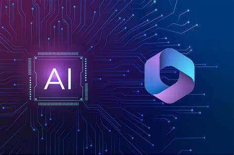
Corporate branding, especially in tech, often involves a blend of visionary ideals, commercial considerations, and compromises driven by committee decision-making. For instance, OpenAI opted for a stark, featureless black dot, reminiscent of a portal into the unknown, while Microsoft’s Copilot logo defies easy description, reflecting extensive collective input.
A notable trend among these logos is their use of soft, inviting colors — hues that evoke approachability without specific meaning. Pastels, gradients into warm tones like pink and turquoise, and soft, continuous shapes dominate, suggesting friendliness and potential rather than qualities like expertise or efficiency.
These visual choices are not made lightly. Detailed design documents likely run into dozens of pages, meticulously outlining the rationale behind every color choice, shape, and animation. Yet, even with such careful consideration, controversies can arise, such as inadvertent associations with controversial symbols or unintended suggestive undertones.
In the realm of AI iconography, the goal is clear: to convey accessibility, openness, and the promise of untapped possibilities. Whether these symbols truly resonate with users and effectively represent the sophisticated technologies behind them remains to be seen.

